8 Ways to Maintain Consistency After Your Rebrand

Rebranding is exciting. It means your business is going through growth. However, throughout this phase, it is essential to maintain consistency within your new brand. Why? Because a potential new customer has to see your brand 7-8 times before even considering purchasing from you. Each of those times, you have a chance to evoke the right gut feeling about your business.
How are you going to do it? Not sure? It's alright. I got you!
I collected 8 ways to help you stay consistent and turn those potential customers into buyers.
8 ways to maintain consistency after your rebrand:
Keep your colors the same
Create contrast with colors
The correct color values on your website/in print
Place your logo on an image
Use dark/light logo version on photos
Use your secondary colors to color code products
Use accent color as button color on your website
Hire a designer to create your assets
Keep your colors the same

As basic as it might sounds, this is important. Colors have meaning. Once you set the color palette that evokes the right emotions around your brand, you need to stick with them. Color is one of the first things people will remember about your business. According to Forbes - "Color improves brand recognition by up to 80%, meaning that customers are 80% more likely to identify you if you consistently use the same color(s) on your branding material."
Create contrast with colors
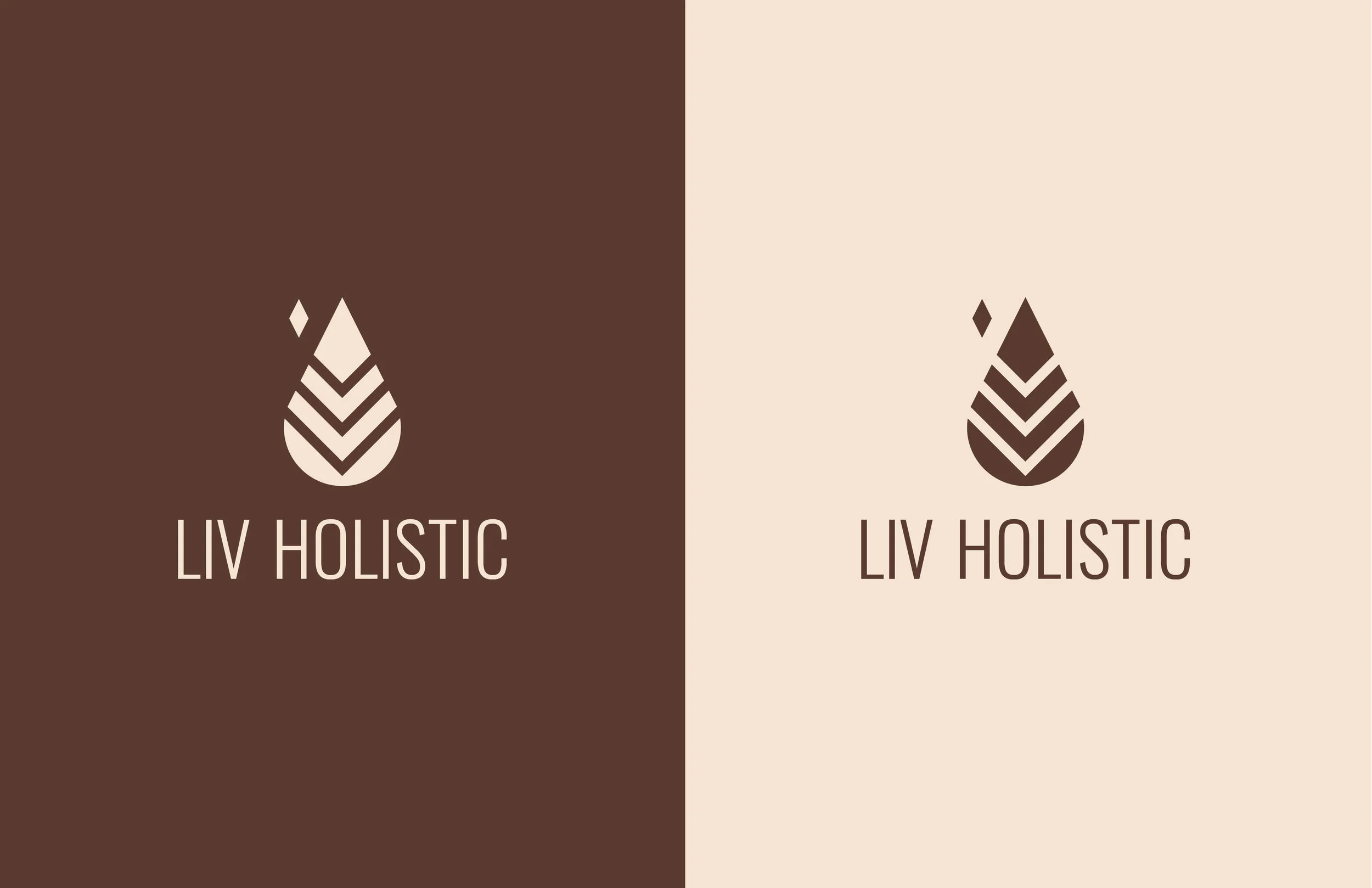
"The brighter something is against its environment, the more it will stand out. High contrast items travel to our brain the quickest, winning our attention and retention." - Opus Design. Use the darkest color on your palette with the lightest version of your logo and vice versa for your brand to be the most visible at all times.
The correct color values on your website/in print
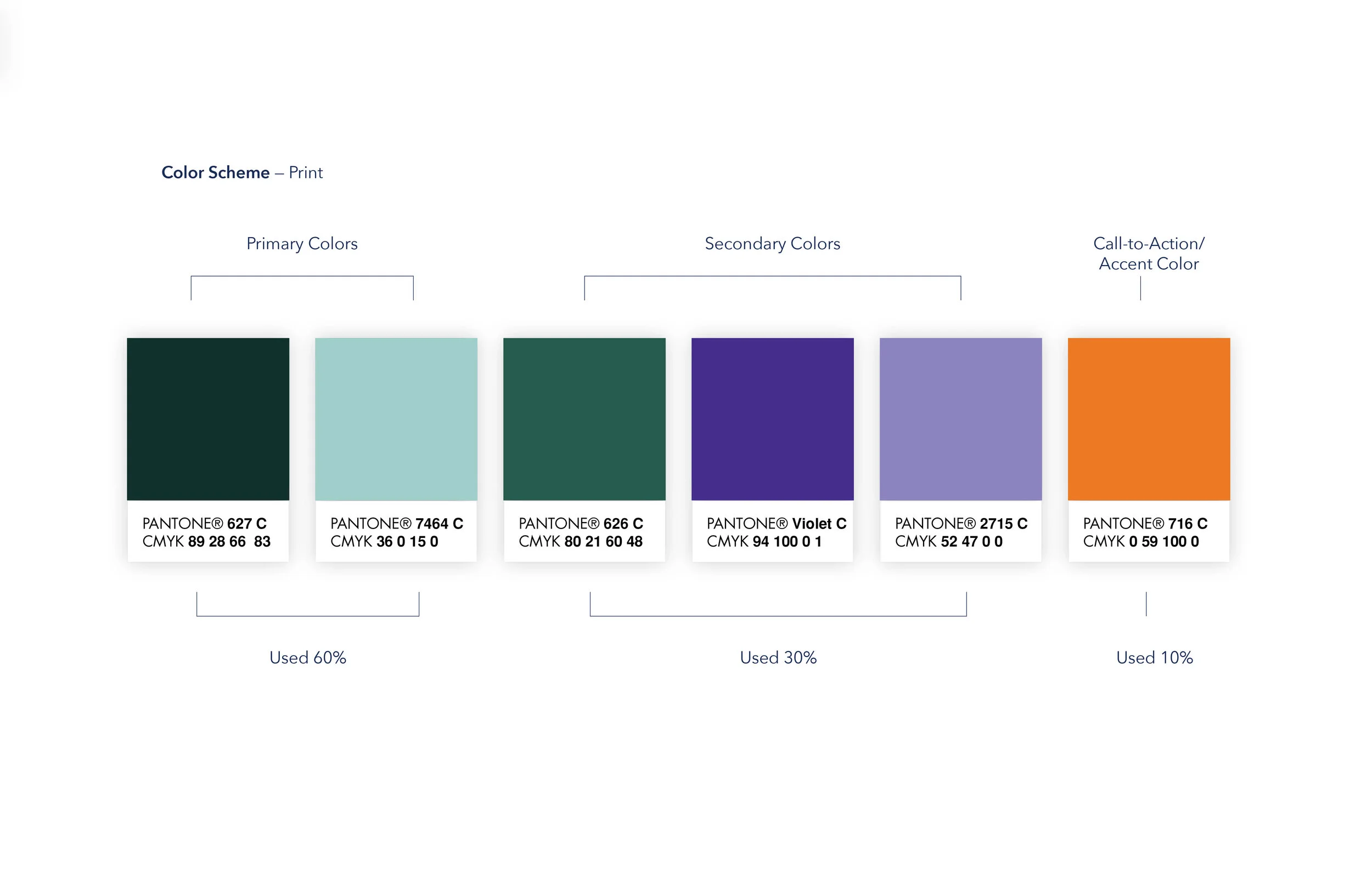

Our printers use CMYK (Cyan, Magenta, Yellow, Black) colors to mix the actual colors, while our computers use RGB (red, Green, Blue) colors to make colors appear on the screen. The proper values for prints are CMYK, or PANTONE values, while for digital are RGB, or HEX values. Using these values will help you to appear consistent with your colors no matter what media you use.
Place your logo on an image

Leaving plenty of breathing room around your logo will more likely grab your viewers' attention. When you place it on a photo, try to find a clear, uniform section of your image to create the most exposure on it while showing your ideal customer in action.
Use dark/light logo version on photos

As I mentioned before, contrast is crucial when it comes to standing out. To make sure your logo is always visible, use the light version of your logo on darker photos, and your dark version on lighter images.
Use your secondary colors to color code products.
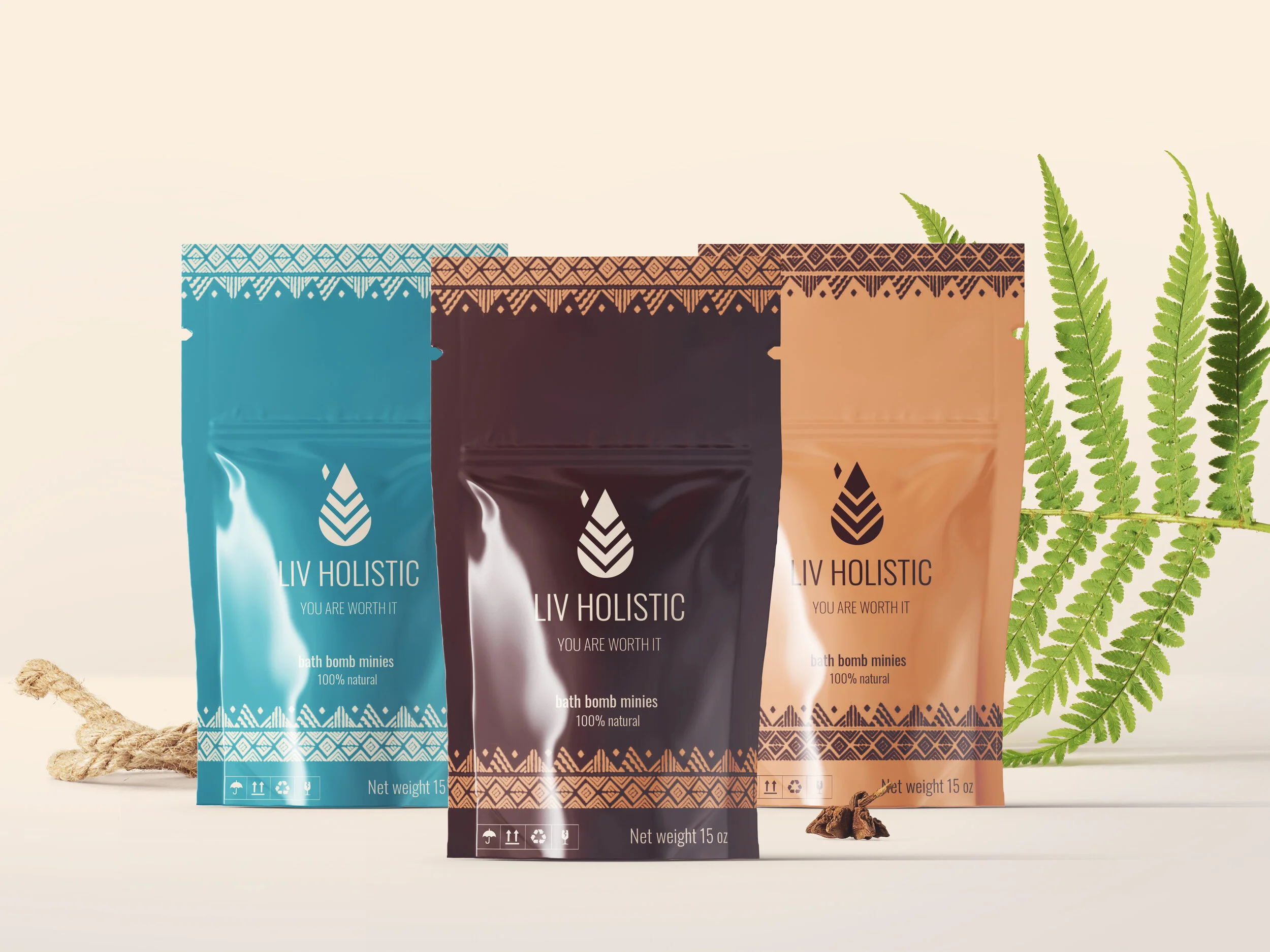
Having secondary colors can help your business to expand. When you are ready to add new products to your business, assign colors to the different scents or flavors to stay on brand. If you do it right, this will help you create better brand recognition over time.
Use accent color as button color on your website.

We use accent colors to create emphasis in a color scheme. These colors can often be bold or vivid and appear about 30% of the time within a design, to emphasize, contrast or create rhythm. They are excellent to use as Call-to-Action or button colors to grab your viewers' attention and encourage them to take action.
Hire a designer to create your assets
Sometimes it's just easier to let someone else do it for you. If you established a brand style guide, but you are still unsure how to use your brand and stay consistent with it, hire a designer to do it. They would be happy to do the work for you, and since you have your brand style guide, you don't have to stand over their shoulders to make sure they are using the appropriate logos, fonts, colors, and images.
Before every purchase, we make the first thing we ask is, "Is this for me?" Creating digital and printed assets that are cohesive across all platforms and evoke the right emotions will help you appear established, trustworthy, and the perfect choice in your prospect's eyes. I hope these tips helped you understand how to stay consistent with your brand after rebranding so you can turn those potential customers into buyers.
Need help with creating consistency in your brand?