About this project
Tomahawk is a conceptual brand project for a business whose ideal customer is the outdoor loving, explorer, ready for adventure at all times in order to achieve a sense of freedom.
Naming
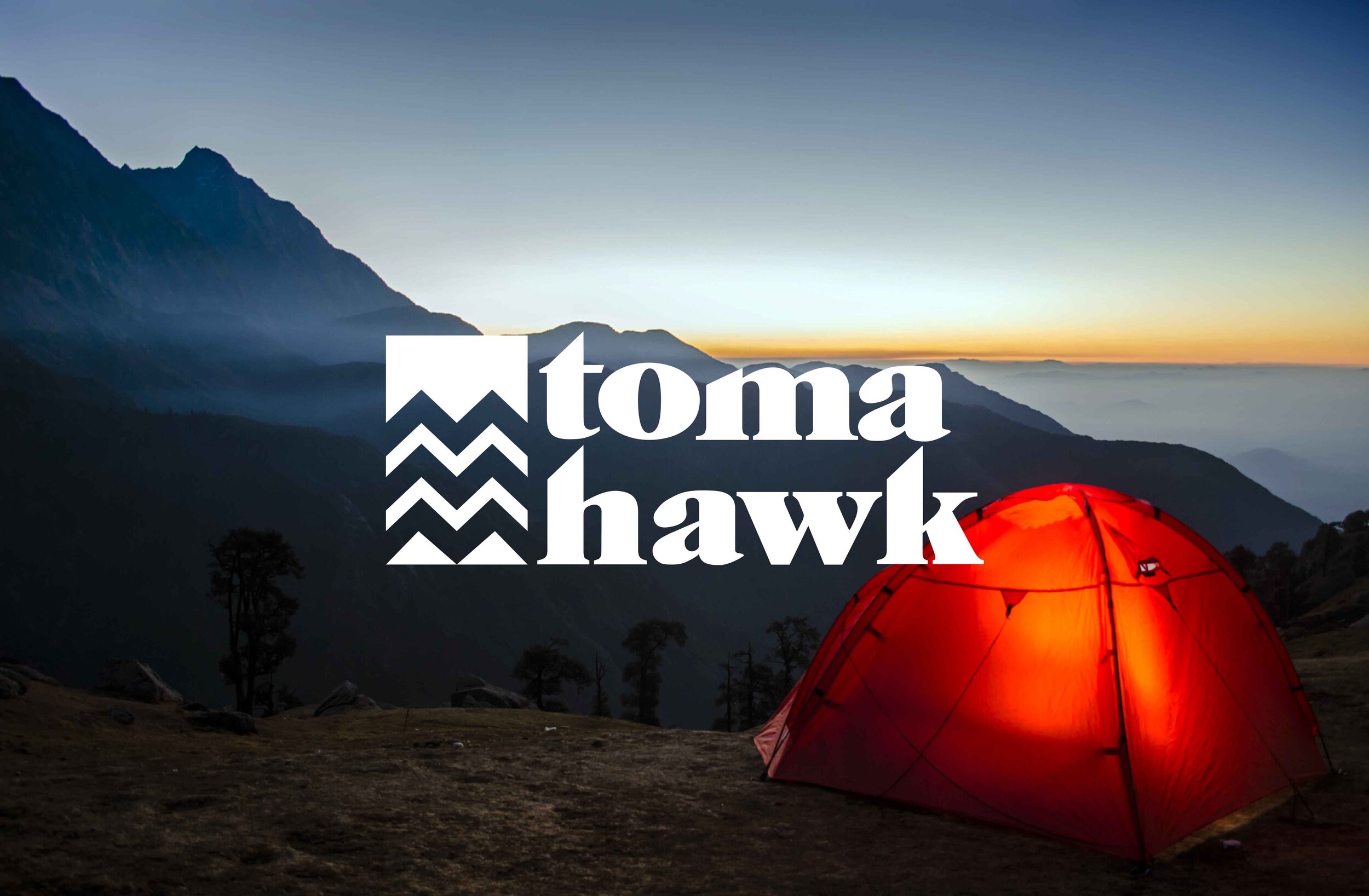
Logo
Brand Identity
Colors were inspired by the colors of sunrise to attract the adventure hungry person who is excited to explore the unknown the new day can bring.

Symbol of mountain tops that was inspired by the Rocky Mountains from a birds-eye view

Proportions from the Golden Ratio was applied to symbol for a more balanced look

Name refers to a type of single-handed axe with sharp edges to attract fearless and risk taking audience